
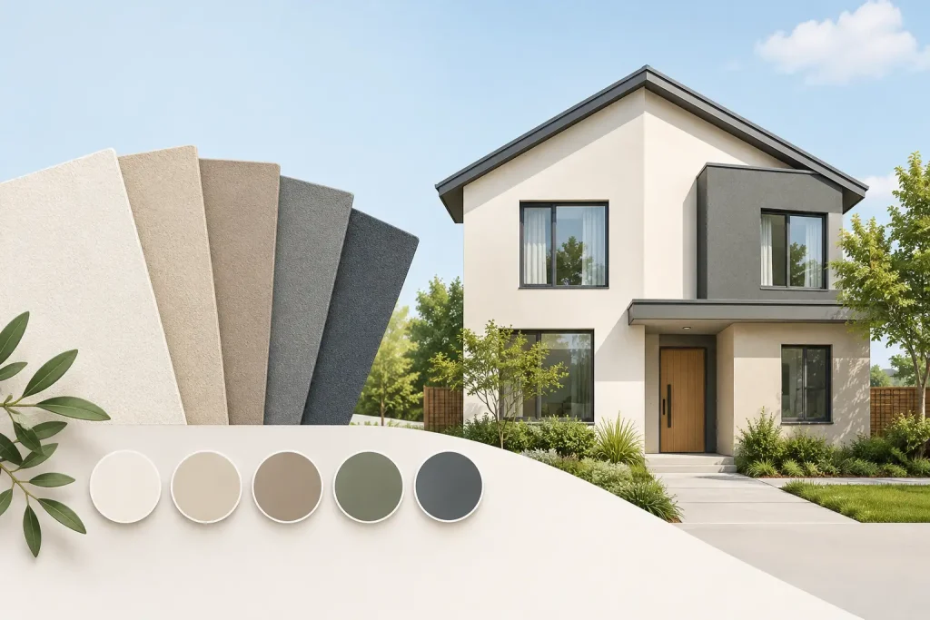
A freshly rendered house can look completely different once the colour goes on. The same finish that looks sharp in a sample can appear too bright in direct sun, too cold on a shaded elevation or out of place beside neighbouring properties. Choosing the best render colours for homes is not simply a matter of picking a favourite shade. It needs to suit the building, its surroundings and the level of maintenance you are happy to take on.
For most UK homes, restrained colours give the strongest long-term result. They age better, appeal to more buyers and let the shape, brickwork, windows and roof do the talking. That does not mean every home has to be magnolia or grey. It means choosing a colour with a clear reason behind it.
Start with the parts of the house that are staying
Before looking at render colour charts, take stock of the fixed features: roof tiles, bricks, window frames, doors, fascias, paving and boundary walls. These are the colours your new finish has to work alongside.
A warm red or brown tiled roof usually sits comfortably with warm whites, creams, soft stone and muted greige shades. A slate roof can take cooler off-whites, pale grey, taupe and more contemporary charcoal details. If a property has retained brick plinths, reveals or chimney stacks, their undertone matters just as much. Red brick often looks better against a warmer render than a blue-grey one.
Window frames make a noticeable difference too. White frames are flexible, while anthracite grey frames can make pale render look crisp and modern. Black frames suit many schemes, but they create a strong contrast. On a small or traditional house, that contrast can feel harsher than expected.
It is worth standing back from the road rather than judging colours from a few inches away. Render is a large surface, and the overall balance is what people see first.
The best render colours for homes in the UK
Warm white and soft cream
Warm white is one of the safest and most effective choices for rendered homes. It gives a clean, well-kept appearance without the clinical feel that pure brilliant white can create. A slight cream, ivory or stone undertone is particularly forgiving under the changing light we get in Britain.
It works well with red brick, clay tiles, timber details and traditional property styles. For homeowners who want a brighter exterior but do not want to repaint or alter the look again in a few years, this is often the sensible option.
Pure white is more of a commitment. It can look excellent on a modern, clean-lined property with dark frames, but it shows traffic film, algae and splashback more readily. North-facing walls and areas close to trees may need more regular cleaning.
Light grey
Light grey remains popular because it looks smart with modern windows and dark roofing. The key is choosing the right undertone. Some light greys contain blue, which can look cold and flat on a shaded house. Others have a warmer, softer base that works more easily with brick and natural stone.
A pale warm grey is a good middle ground for many homes. It feels contemporary without being a passing trend, and it usually hides minor marks better than white. It is also less likely to make a house look gloomy than a mid or dark grey used over the entire exterior.
Greige, taupe and mushroom tones
Greige sits between grey and beige, while taupe and mushroom colours bring a little more warmth. These are useful shades where a homeowner wants a calm, high-quality finish that does not look stark. They work especially well on detached homes, period properties and extensions where new render meets older materials.
These colours are also practical. They are generally more forgiving of everyday dirt than very pale finishes, and they tend to sit comfortably in both town and rural settings. The trade-off is that they need careful matching to the roof and brickwork. A taupe that is too pink, yellow or brown can quickly look dated.
Stone and sandy neutrals
Stone, biscuit and soft sand colours suit homes with natural-looking materials, buff brick or brown roof tiles. They can make a large rendered elevation feel less imposing and are often a good answer for homeowners who find grey too cool.
The best versions are muted rather than yellow. Strong beige can be difficult to pair with white uPVC, grey composite doors or dark roof tiles. A subtle stone shade keeps the exterior warm while still looking clean and current.
Deeper shades for details, not whole walls
Charcoal, dark grey and deep green can look very effective on feature sections, porch walls, garden rooms or smaller upper panels. Used with a lighter main colour, they add depth and pick up dark windows or roofing.
Using a very dark colour across every rendered wall needs more thought. Dark surfaces absorb more heat in sunshine and can make a modest property appear smaller. They also show dust, marks and fading differently from lighter colours. A site assessment and the chosen render system both matter here, so do not make the decision from a phone image alone.
Light changes the colour more than most people expect
A render colour card is useful, but it is not enough. Colours look lighter and brighter outside than they do under indoor lighting. A pale grey chosen from a small sample may read almost white on a south-facing wall, while the same colour can look noticeably darker on the north side of the house.
Ask to see a larger sample and view it in the morning, afternoon and on an overcast day. Hold it beside the roof, window frame and brickwork. If possible, look at the proposed colour on a similar property, but remember that its orientation and surroundings may be different from yours.
Essex homes can vary widely, from older cottages and Victorian terraces to newer estates and rural properties. A bold colour that suits an isolated modern build may be less convincing on a closely spaced street. The aim is not to blend into the background completely, but to choose a finish that feels right for the building.
Think about maintenance before choosing white or dark grey
Every exterior collects dirt eventually. Rainwater runs, vegetation, nearby roads, chimneys, birds and soil splash all affect how a rendered surface looks over time. Colour will not remove the need for occasional care, but it can make day-to-day marks more or less obvious.
Very light render can show staining around downpipes, beneath sills and near the ground. Very dark render can reveal pale dust, water spotting and scuffs. Mid-tone shades such as warm grey, stone or greige are usually the most forgiving choice for busy family homes and rental properties.
Good detailing is just as important as colour. Sound gutters, properly fitted downpipes, well-finished sills and sensible ground levels all help protect the appearance of the render. There is little point choosing a premium finish if water is repeatedly running down the face of the wall.
Match the colour to the render finish
The texture and system used can change how colour is perceived. A finer finish often looks sharper and more uniform, while a more textured surface creates small areas of light and shadow. This can make a shade appear richer or slightly darker from certain angles.
Cork spray finishes offer a different visual character from a flat traditional render, with a textured appearance that can suit both modern and older properties. The colour should still be selected with the same care, particularly where it meets existing brickwork, painted woodwork or cladding.
Do not assume a colour will look identical across different materials. A grey door, grey fascia and grey render may each have a different undertone and sheen. Choosing them together avoids the almost-matching look that can make an otherwise tidy job feel unfinished.
A simple way to narrow down the choice
Start with two or three colour families rather than trying to review every shade available. For example, compare a warm white, a pale warm grey and a light stone. Then rule out colours that fight with the roof, windows or brickwork.
Once you have narrowed it down, look at larger samples outside over several days. Check the front, side and rear elevations where the light differs. If you are planning darker features, decide where they will sit and how much of the frontage they will cover. A dark panel can look balanced around an entrance but overpowering across a full gable.
A professional renderer can help assess the existing surfaces and advise on a finish that will look consistent across the property. At Lee Crane Plastering, the focus is on getting the preparation, detailing and final appearance right, not simply applying a colour chosen from a chart.
The right render colour should still look considered when the weather is dull, the garden is untidy and the house is viewed from the pavement. Choose a shade that works with the building rather than one that only looks impressive in a showroom sample.